In the meantime, I just finished my book cover version for Garth Nix's Sabriel. Below are process pictures along with the final version.
First there were thumbnails. And they were good. I came up with several ideas and then went with the one I felt strongest about (middle right). I also liked the bottom right corner idea, but felt like the composition was more interesting with the latter thumbnail.
The drawing!
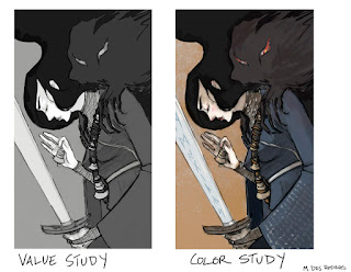
I did a few value studies then settled on my values, moving onto a color study. Sometimes in the past I've been too impatient in starting a piece and skip these two vital steps. Never again. It makes the actual painting process much more fun since I found myself way less confused and angry when I would get lost. Guides are great to have, as it turns out! Just running blindly into the forest isn't always the best idea as I've discovered after years of getting lost in its midst.
And the final illustration! This was drawn in graphite and ebony pencil, then painted with inkwash and some white gouache for details. I then scanned it and did some photoshopping for textures, color correction, and value pushes. I really enjoyed working traditionally and digitally.
Let me know what you think!
See you all tomorrow on the interwebs when I get back to my new posting schedule!


1 comment:
Love the way this came out! The composition, the way it has a lovely balance towards both definition and a flat aesthetic, like the pattering in the clothing, that seems to nod towards Japanese prints. I love the clothing! The key pattern and the mail, very nicely done!
Post a Comment