Here are linearts for illustrations I've been working on/had in line to finish correcting and developing. However, it may be due to looking at them and fudging with them one too many times but I've decided to abandon these drawings in lieu of just starting over with completely new concepts. But there were still some qualities about them which nagged at me not to abandon... so here they are for your viewing pleasure alone. I doubt they'll see the light of day again, but each allowed me to learn a lot in the process of drawing it.
 Attempted Illustration: a one point fantasy city scene
What I liked about it: the fact that it's a background heavy illustration. Also, I am still fond of the figure walking away with the cat. I also enjoy one point perspective for bringing the scene in on a specific point.
Why it's getting trashed: there are one too many little things to correct which makes me just want to start anew. The details in the infrastructure can be better. Also, the figure in the left peaking around the corner has one too many anatomical things wrong with it so I feel it'd be best to start from scratch.
What I learned: Detail, details, details. I need to be more patient and take the time to add some for heightened realism, as well as visual interest. Personally, I find those things impressive and inviting in illustrations--particularly background-heavy ones. But I can certainly say I feel 100% comfortable with 1 pt perspective now with all its little nuances.

 Attempted Illustration: Space Future, Go! a take on a scene from the fairy tale Beauty and the Beast

Attempted Illustration: a scene from the book Phantom in The Sword of Truth series by Terry Goodkind. This is one of the main characters, Kahlan, trying to save a little girl from the Sisters of the Dark who just slaughtered her parents.
What I liked about it: all the details in the clothing, which I still feel is pretty decent. Also, the pose of Kahlan (the woman grabbing the girl) is still pretty good to me.
Why it's getting trashed: Not seen here is the background I incorporated. It was a little too wonky with one too many perspective issues (I believe it was a 3 pt or 2pt vertical). Background aside, the pose of the girl still has some problems--the foot in the foreground is bothersome. Also, I feel that I could have made her look younger. The anatomy isn't terrible, but it could be better.
What I learned: Motherfucking boots. Look at those sons of bitches. Awesome. You should see the lumpy, formless rainboot it originally was. I also worked pretty hard on the proportions and pose, but still feel that it falls short. I made some ground, but there's still more to do.
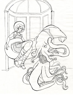
 Attempted Illustration: Space Future, Go! a take on a scene from the fairy tale Beauty and the Beast
What I liked about it: Look at that beast! How cute is he? Also, it was so fun to draw all those tentacles and I think they came out pretty good overall. I also like the clothing and pose (mostly) of the Beauty. The overall concept of the illustration I'm fond of, even if there is no remaining Beauty and the Beast storyline elements at this point (in previous versions there was more furniture and developed background)
Why it's getting trashed: I started coloring the illustration but just couldn't get over those knees on the girl. Also, her face is... meh. I wanted to be able to work on the drawing larger in order to correct these things, but was already somewhere around 12x18 or 18 x24... I'd already worked on transferring and correcting the image for so long that utilizing my frankenstein-way of transferring a larger version with the supplies at hand just felt too daunting. Wasn't sure if the illustration was worth it.
What I learned: how to draw a squid-octopus monster. And that part was awesome.
There it is. Now these folders of drawings will go to the terabyte harddrive in the sky....err... living room.