Thursday, June 23, 2011

The King in the North! The King in the North!


Drew this yesterday in my Expressive Drawing class. I've been pretty obsessed with The Song of Ice and Fire series after getting hooked from the tv show---I know, I know, I'm late to this fantasy party train full of weeping, but the show Game of Thrones is the best damn adaptation I've seen. Hence, Robb Stark as the King in the North. My scanner cropped it a bit since the original is a bit too large, but I have plans for coloring this bad boy in the future.

THE KING IN THE NORTH! THE KING IN THE NORTH!

Tuesday, June 7, 2011

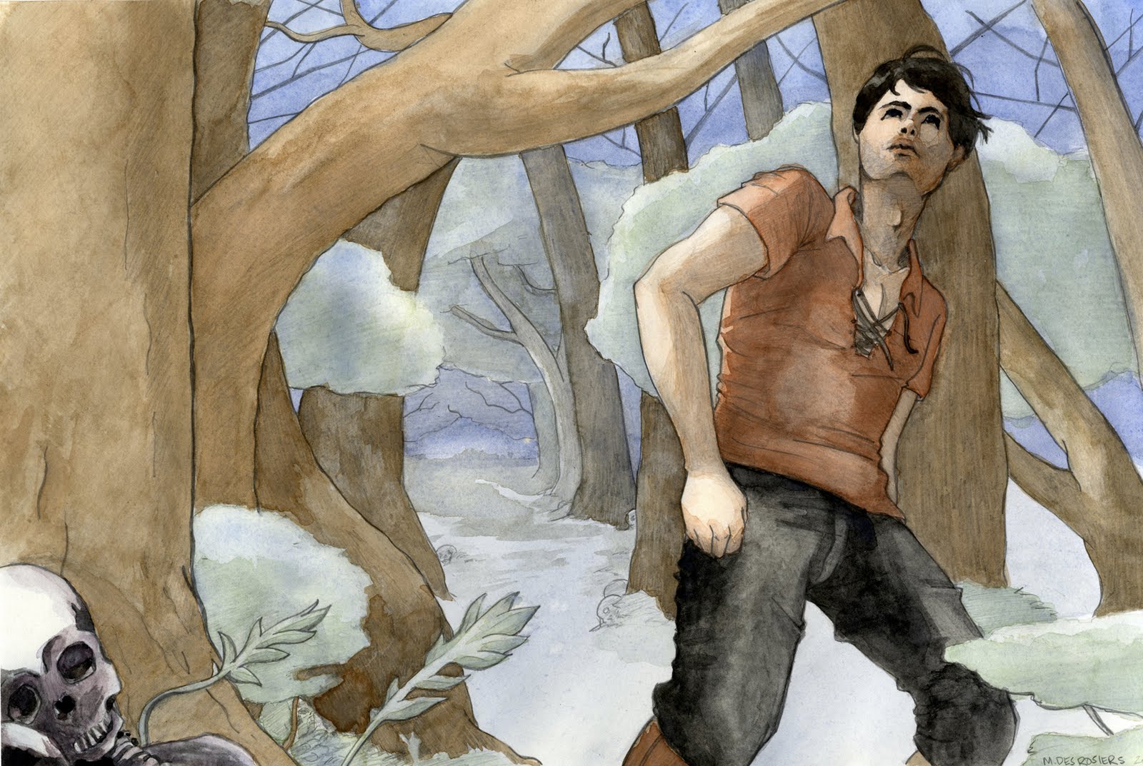
Quest for the Night Wisps

Next Illustration down! My final for Watercolor class this past Spring has been fixed up and is good to go. I illustrated a scene from Phantom, by Terry Goodkind.


First I illustrated the scene after some thumbnails and color roughs. Once the composition was chosen, I had my wonderful boyfriend pose for me, scoured the internet for references, visited the Redwoods here in Oakland to get in the forest mindset (and to take good reference photos), then drew the basic illustration to size, working on getting proportion, scale, etc all right.


I was told about this sweet technique for watercolor in which you use a H pencil (MUST be Hard, and Bs will just smear) to draw and shade however much you'd like, then lay the watercolor over the pencil for a nice texture to show through. Definitely will be doing more of this.


Then a wash of blue for the underlayer....

and a whole bunch more until the finished product (probably should have taken more process shots, but it was the frenzy of finals afterall...)


"In the moonlight, Richard immediately noticed that there was something wrong with the trees. It looked as if they were all dead. The fat, squat trunks were twisted and gnarled. The bark had started to come away in ragged strips. The bent and distorted branches looked like claws reaching out to snatch anyone who dared enter the place" (oh, and
there's a lot of skulls and corpses everywhere, too).

~ Phantom, The Sword of Truth series by Terry Goodkind

Friday, May 27, 2011

Sexy Bear is Sexy


I present to you my favorite in class painting from my Spring semester at AAU. Sexy Bear is sexy. Once my instructor added that bear prop with the girl I was intrigued; when he put the mask on the bear I was hooked.

This is the first of an onslaught of work I'll be posting from the Spring now that I've survived. There was an ASSTON of painting and I must say... oil painting is difficult. I do enjoy the process and experience of painting and will continue to paint in the future, but I feel like it may just be for pleasure for now. Until I experiment a bajillion times more with the medium, I'm not confidant to call it my own.

My experience with watercolors on the other hand.... There will most definitely be more of that in the future.

Now, without further ado, more pictures.


He's watching you....

Friday, March 11, 2011

Aaa....

...aaaaaaaaaaaaaaaaaaaaaaahhhhhhhh!!!!!!


Lots and lots of painting! And I'm still not that good at it... but gotta level up my oil paint skills somehow. This semester is pretty crazy, so it's impossible for me to make a coherent post right now. I hope you enjoy the in process painting photos (and random model set-ups/pretty flowers).

Monday, January 24, 2011

Yonder Forsaken

Here are linearts for illustrations I've been working on/had in line to finish correcting and developing. However, it may be due to looking at them and fudging with them one too many times but I've decided to abandon these drawings in lieu of just starting over with completely new concepts. But there were still some qualities about them which nagged at me not to abandon... so here they are for your viewing pleasure alone. I doubt they'll see the light of day again, but each allowed me to learn a lot in the process of drawing it.


Attempted Illustration: a one point fantasy city scene
What I liked about it: the fact that it's a background heavy illustration. Also, I am still fond of the figure walking away with the cat. I also enjoy one point perspective for bringing the scene in on a specific point.
Why it's getting trashed: there are one too many little things to correct which makes me just want to start anew. The details in the infrastructure can be better. Also, the figure in the left peaking around the corner has one too many anatomical things wrong with it so I feel it'd be best to start from scratch.
What I learned: Detail, details, details. I need to be more patient and take the time to add some for heightened realism, as well as visual interest. Personally, I find those things impressive and inviting in illustrations--particularly background-heavy ones. But I can certainly say I feel 100% comfortable with 1 pt perspective now with all its little nuances.


Attempted Illustration: a scene from the book Phantom in The Sword of Truth series by Terry Goodkind. This is one of the main characters, Kahlan, trying to save a little girl from the Sisters of the Dark who just slaughtered her parents.
What I liked about it: all the details in the clothing, which I still feel is pretty decent. Also, the pose of Kahlan (the woman grabbing the girl) is still pretty good to me.
Why it's getting trashed: Not seen here is the background I incorporated. It was a little too wonky with one too many perspective issues (I believe it was a 3 pt or 2pt vertical). Background aside, the pose of the girl still has some problems--the foot in the foreground is bothersome. Also, I feel that I could have made her look younger. The anatomy isn't terrible, but it could be better.
What I learned: Motherfucking boots. Look at those sons of bitches. Awesome. You should see the lumpy, formless rainboot it originally was. I also worked pretty hard on the proportions and pose, but still feel that it falls short. I made some ground, but there's still more to do.
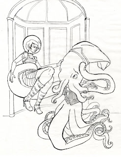


Attempted Illustration: Space Future, Go! a take on a scene from the fairy tale Beauty and the Beast
What I liked about it: Look at that beast! How cute is he? Also, it was so fun to draw all those tentacles and I think they came out pretty good overall. I also like the clothing and pose (mostly) of the Beauty. The overall concept of the illustration I'm fond of, even if there is no remaining Beauty and the Beast storyline elements at this point (in previous versions there was more furniture and developed background)
Why it's getting trashed: I started coloring the illustration but just couldn't get over those knees on the girl. Also, her face is... meh. I wanted to be able to work on the drawing larger in order to correct these things, but was already somewhere around 12x18 or 18 x24... I'd already worked on transferring and correcting the image for so long that utilizing my frankenstein-way of transferring a larger version with the supplies at hand just felt too daunting. Wasn't sure if the illustration was worth it.
What I learned: how to draw a squid-octopus monster. And that part was awesome.

There it is. Now these folders of drawings will go to the terabyte harddrive in the sky....err... living room.

Wednesday, January 19, 2011

The Queen's After Party


And finally, here is the last of the pastel drawings from my class this past Fall semester. These are of the model as a queen at a party... drunken Queen FTW! Very fun to draw... I mean, who doesn't like a sloppy, drunk Queen spilling wine all over herself?


There are some drawings which I was going to develop and finish, but have decided not to for some reason or another. I'll be posting the lineart for these rejects soon, should anyone convince me otherwise to rescue them from the eternally unfinished bin.

Monday, January 3, 2011

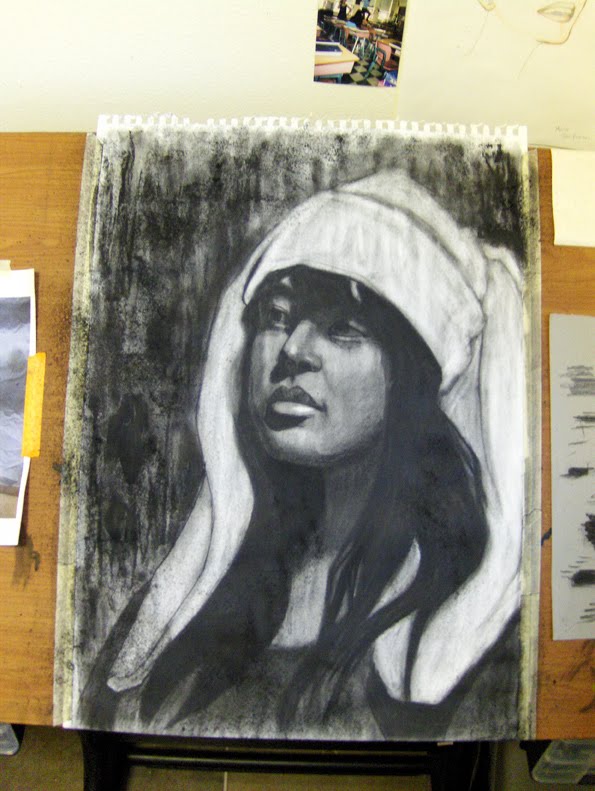
Snow Bunny (w/o snow)

Happy New Year, everyone! Here's to working toward 2011 being a productive, creative, and fun year!

But first, one last post from my past semester. This was my final for a Head Drawing class at AAU. Enjoy!


The assignment was to draw from a chosen reference pool of our fellow classmates. Since my camera sucks, most of the time I have to base my decision more on which photo isn't blurry, but luckily this particular shot came out well. How could I resist a bunny hat?


There's something I like about the simple, flat shapes in this beginning stage.


Acetone splatter!


And here was the final I turned in for class. After some critique from my instructor, and my own realization once it was up on the wall and I was feet away, there needed to be some changes made. The brightness of the hat was too stark and drew away from my desired focal point of the face (namely eyes and nose). Throw that sucker back up on the drawing board!


Here it is with corrections. I lightened up the face and darkened some areas more to enhance the contrast, hopefully negating some of that surging bright power of the white bunny hat. I'm satisfied with the drawing overall, and have come to appreciate charcoal more after this class. Of course, once I found out about splatter textures my relationship with charcoal deepened that much more. You will never take my acetone!!!